
Product Design · Feature Integration · Visual Identity · iOS · Android · Windows
Stepping into a live product and making it yours
I joined CBT Nuggets as the sole product designer on a native app suite already in market across five platforms. My work: bring a new download experience to life and translate a full visual identity update into a cohesive mobile UI — without disrupting what 100,000+ learners already depended on.
Outcome
Q4 2020 - Q1 2021
Scheduled tours in 2025 compaired to 22,543 scheduled in 2024
App Store rating maintained through the full visual refresh
Of the training library available offline after download launch
ℹ️
The initial app architecture and launch were led by my predecessor. I inherited that foundation and took full design ownership from 2018 onward — responsible for all feature work, visual direction, and cross-platform consistency from that point forward.
Context
What I inherited, and what was mine to build
Starting on a live product is a different design problem than starting from zero. The hard architecture decisions had already been made — navigation patterns, content hierarchy, the core learning loop. My job was to understand those decisions well enough to extend the product without introducing friction, then bring two major initiatives forward: offline download management and a visual identity refresh across every platform.

INHERITED FOUNDATION
ALREADY IN MARKET
- App architecture across iOS, Android, Windows
- Navigation patterns and content hierarchy
- Authentication and account flows
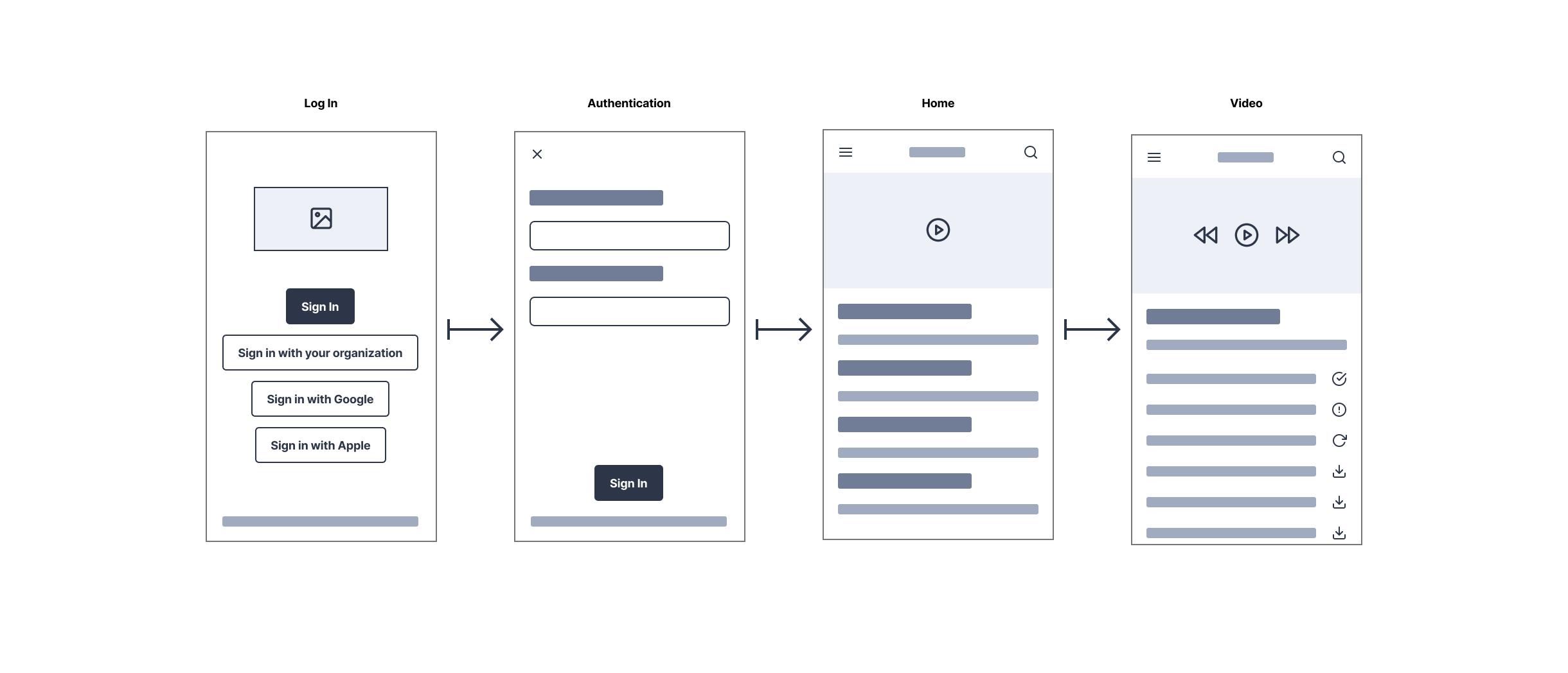
- Video player and course detail screensInitial visual language and component library

MY CONTRIBUTION
MY SCOPE
- Download feature
- UI refinement and icon system design
- Visual identity update applied across all app surfaces
- Cross-platform consistency of the new VIS
- Collaboration with brand team on mobile translation
- Ongoing design ownership and system maintenance
The Challenge
Two initiatives, one shared constraint
Both projects — downloads and the visual identity update — shared the same underlying constraint: I couldn't break what was already working. CBT Nuggets had a loyal subscriber base who'd formed habits around the existing app. Any change to visual language or new feature had to feel like a natural extension, not a redesign.
"The best feature addition is one that feels like it was always there. The best visual refresh is one users notice feels better — without knowing why."
For the download feature, a spec existed — but specs don't account for the edge cases that only surface when you're designing actual screens. Empty states, partial downloads, storage warnings, failed downloads. I refined the UI to handle every state gracefully and designed an icon system that communicated status at a glance, without relying on text.
For the visual identity work, the brand team delivered updated guidelines built for web and print. Translating that into something native on iOS, Android, and Windows required judgment calls at every level — type scales, touch targets, color application in dark environments, interactive states. I kept the brand recognizable while making each platform feel like it belonged there.
Key Design Decisions
Where the real judgment calls happened
DECISION 01
A three-state icon system for downloads
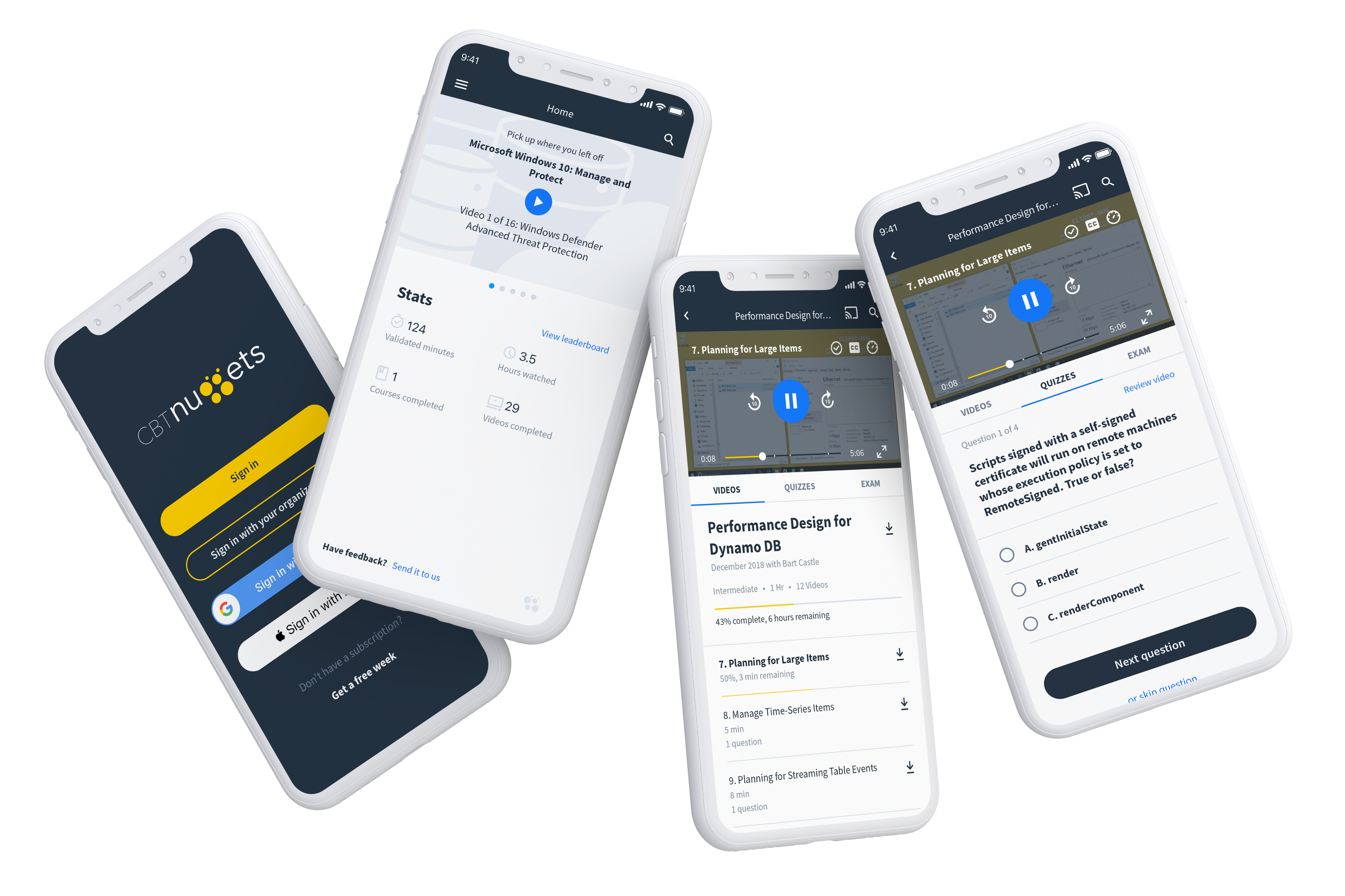
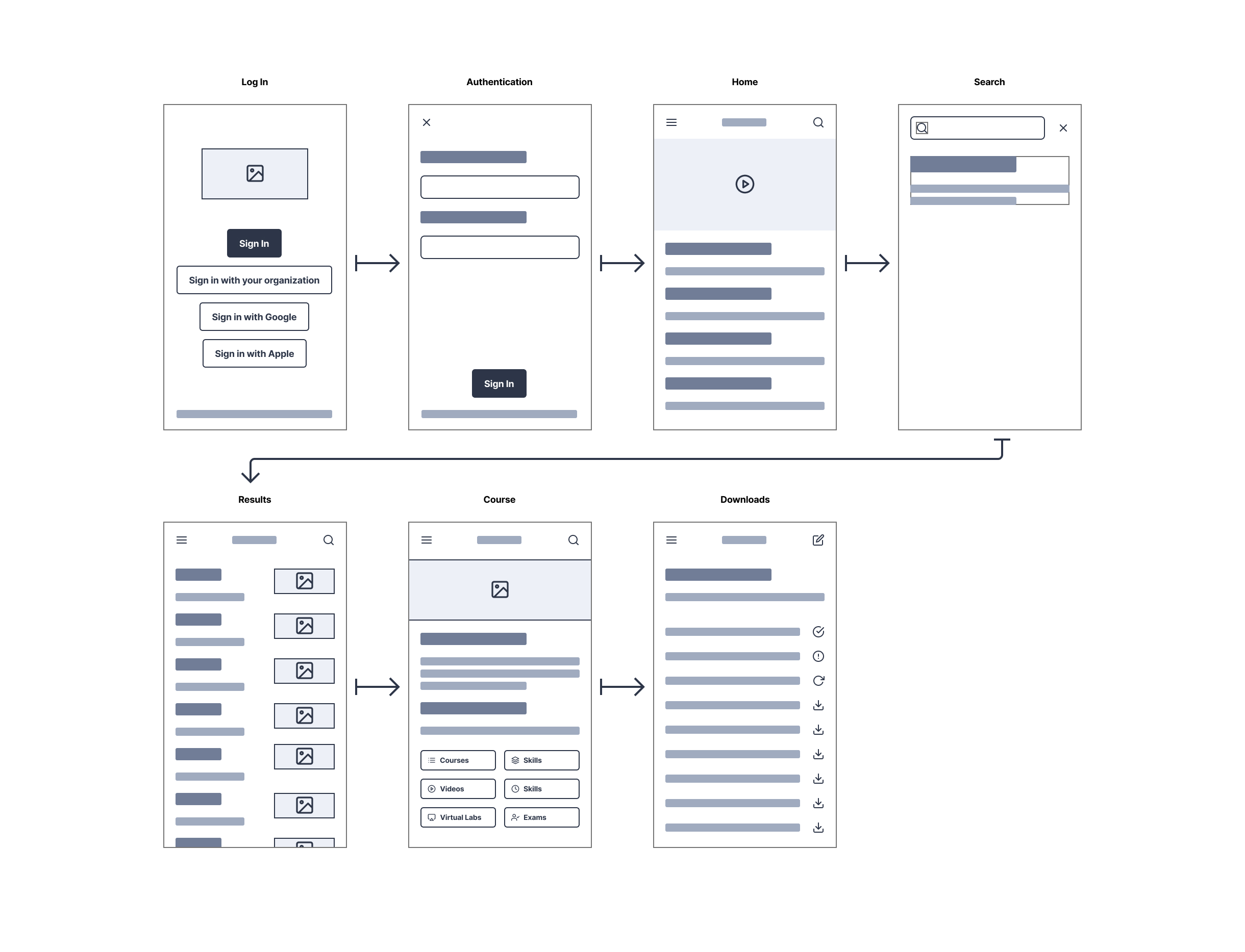
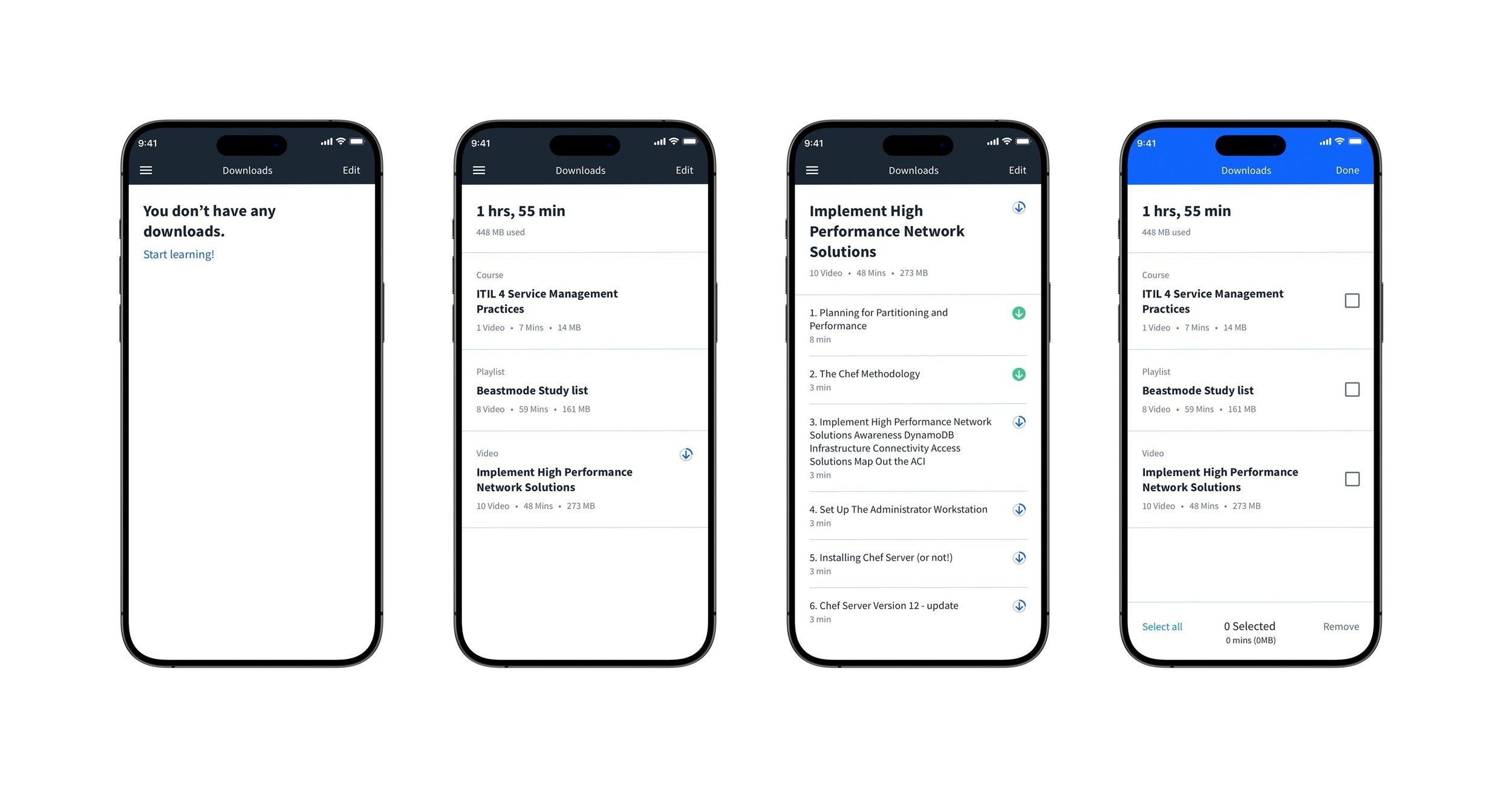
The spec called for download functionality but didn't define how status would be communicated visually. I landed on three distinct icon states — available, in progress (with an animated progress ring), and complete — each unambiguous at small sizes. The goal was zero confusion without a word of supporting text. IT learners saving content before a flight shouldn't have to wonder if something finished downloading.
Decision 02
Downloads as a first-class destination
Downloads could have been buried in settings. I made it a top-level screen in the navigation — because a learner's offline library is functionally their portable classroom. It needed the same structural respect as the course library itself. The screen surfaces storage used, total duration, and file-level control, with an edit mode for bulk removal that mirrors native iOS conventions learners already knew.
Decision 03
Rebuilding components, not just reskinning them
The brand team's updated system was built for web. Applying it to mobile meant I rebuilt the component library from scratch rather than applying new colors to old components. Reskinning would have looked like a reskin. Where brand guidelines conflicted with platform HIG conventions, I documented the decision and aligned stakeholders explicitly — rather than quietly drifting from either standard.
Visual Identity System
Translating the brand to mobile
Working alongside the CBT Nuggets brand team, I built the mobile-specific layer of their updated visual identity — type scales, color tokens, interactive states, spacing, and iconography — that made the brand feel intentional on every screen and every platform. The signature dark navy and gold carried through, rebuilt into components that felt native rather than ported.
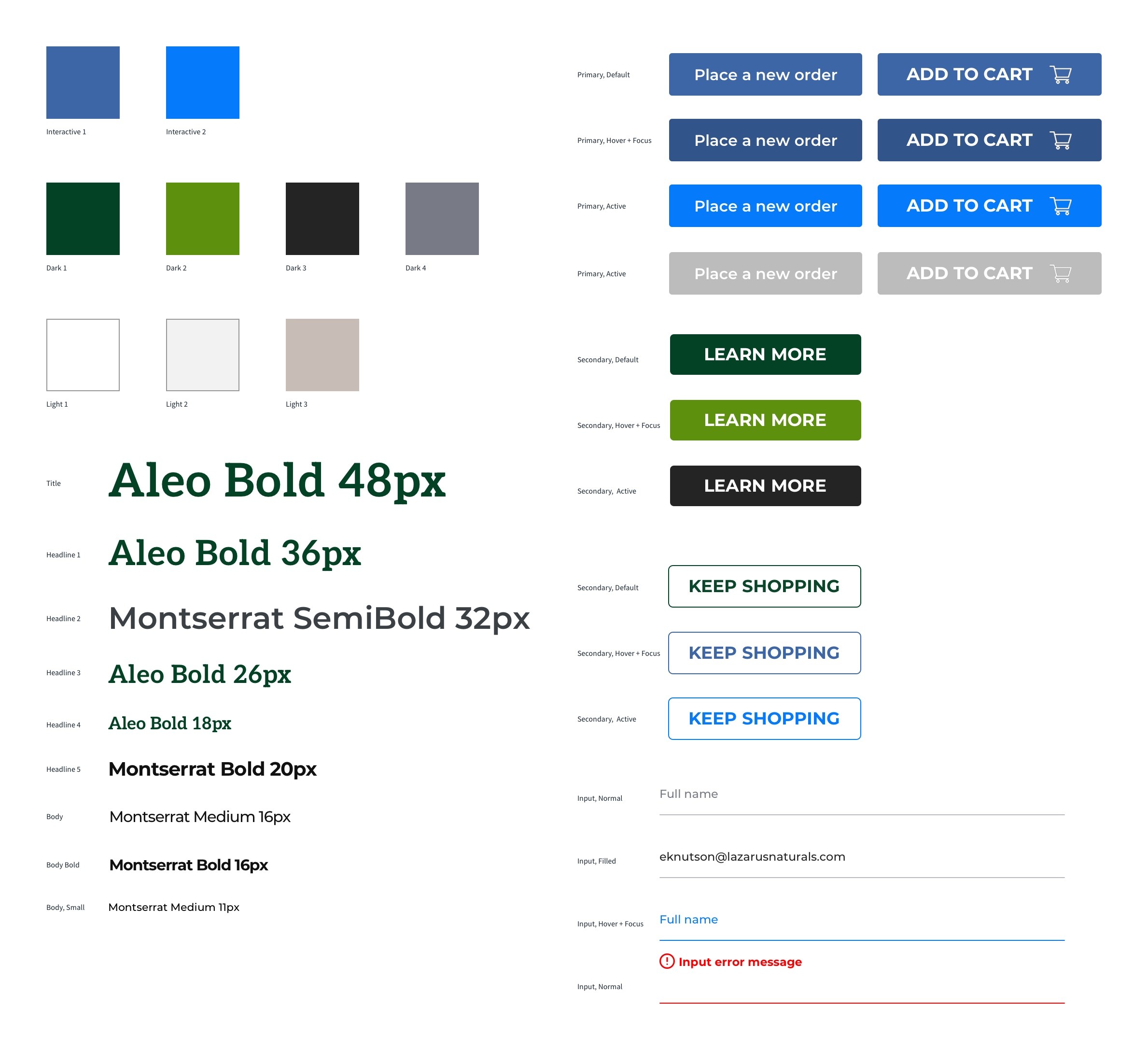
The updated system gave every screen a sharper, more considered feel while keeping the brand immediately recognizable to existing subscribers. The rebuild also gave the engineering team a cleaner handoff — documented tokens and component specs that made future work faster and more consistent across the team.
Visual Identity System
Translating the brand to mobile
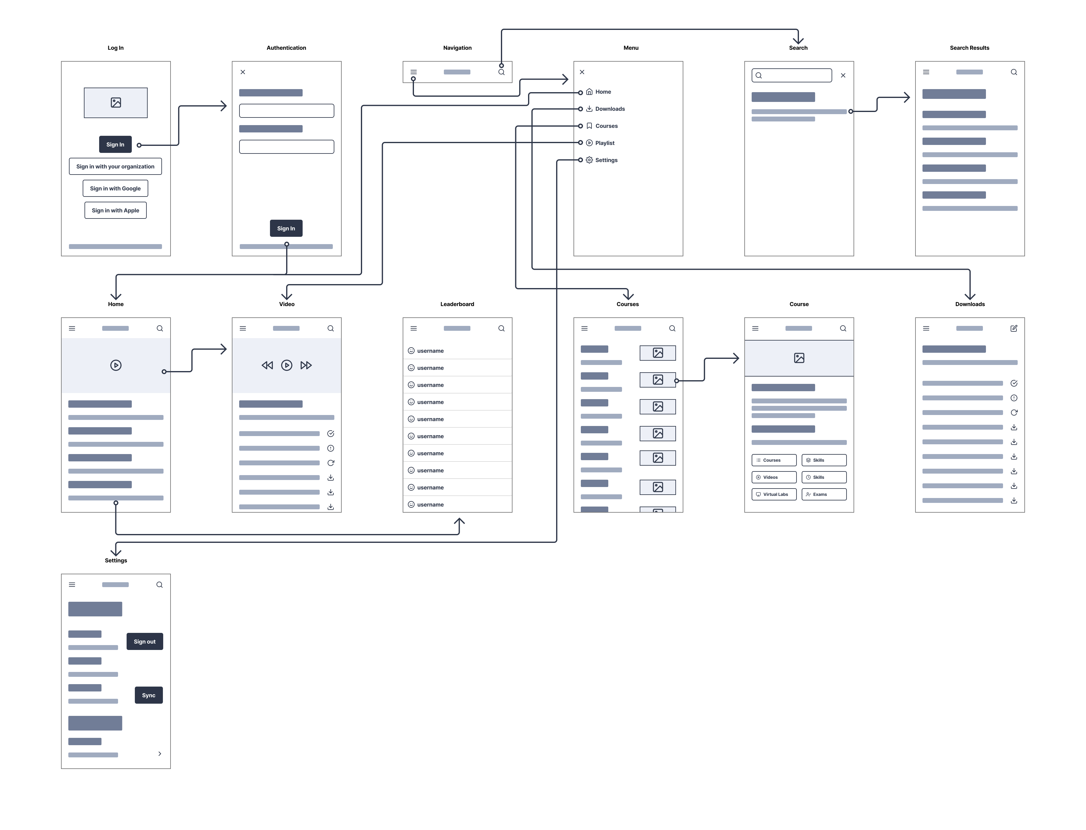
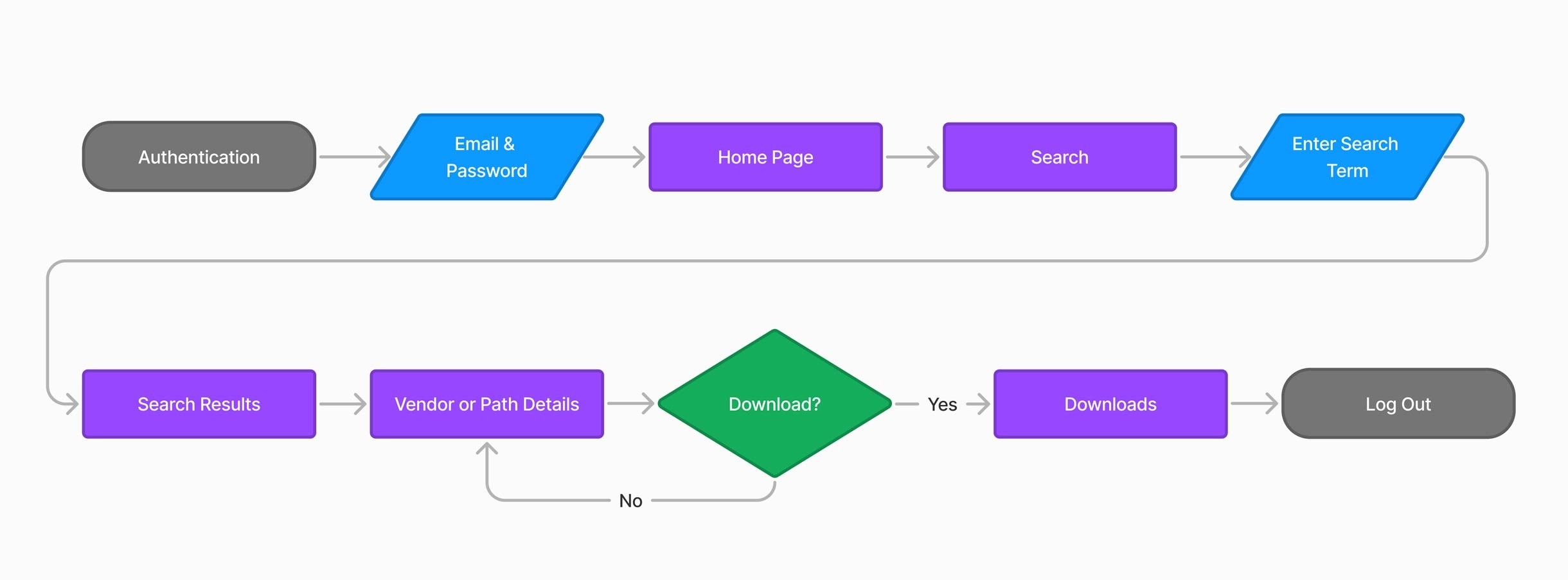
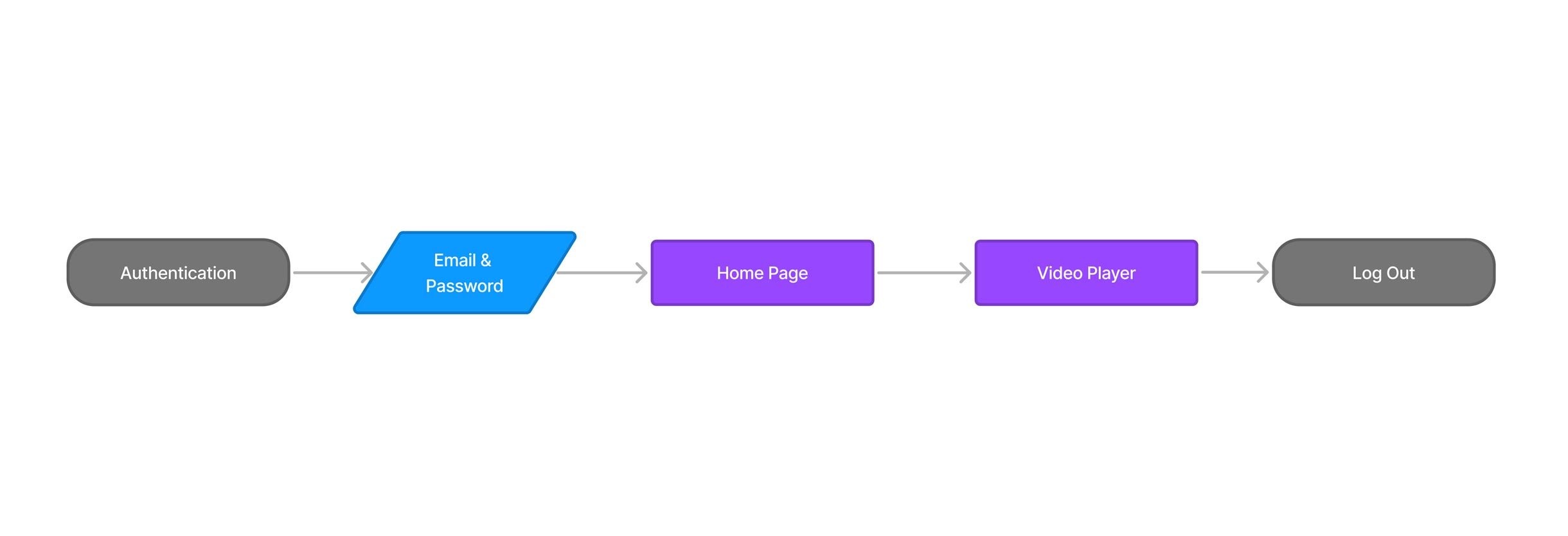
The app's information architecture was already established when I joined. My first step was mapping it completely — understanding every screen, every connection — so I could identify precisely where the download feature and visual tokens needed to integrate without disturbing existing flows.
Process
The work behind the screens
The app's information architecture was already established when I joined. My first step was mapping it completely — understanding every screen, every connection — so I could identify precisely where the download feature and visual tokens needed to integrate without disturbing existing flows.
Final Screens
The shipped experience
These screens reflect the updated visual identity applied across the product — and the download feature fully integrated into the app's information hierarchy. Each surface was rebuilt with the new component library, not patched with new colors.

Reflection
What the work delivered
Shipping a visual identity update on a product with an active, loyal subscriber base is a high-stakes design problem. The update has to feel like progress, not disruption. Maintaining a 5-star rating through the refresh is the clearest signal that it landed the right way.
The download feature gave learners something genuinely new: a personal offline library, managed transparently, with clear status at every step. It removed the last barrier between CBT Nuggets' content and the moments in learners' days when they actually had time to train — on a commute, in a hotel, at a job site without reliable Wi-Fi.
Beyond the two initiatives, taking full design ownership of the system meant future feature work had a stable, documented foundation to build from — a component library, token system, and cross-platform spec that the team didn't have before.
Product Design · Feature Integration · Visual Identity · iOS · Android · Windows
Stepping into a live product and making it yours
I joined CBT Nuggets as the sole product designer on a native app suite already in market across five platforms. My work: bring a new download experience to life and translate a full visual identity update into a cohesive mobile UI — without disrupting what 100,000+ learners already depended on.
Outcome
Q4 2020 - Q1 2021
Scheduled tours in 2025 compaired to 22,543 scheduled in 2024
App Store rating maintained through the full visual refresh
Of the training library available offline after download launch
ℹ️
The initial app architecture and launch were led by my predecessor. I inherited that foundation and took full design ownership from 2018 onward — responsible for all feature work, visual direction, and cross-platform consistency from that point forward.
Context
What I inherited, and what was mine to build
Starting on a live product is a different design problem than starting from zero. The hard architecture decisions had already been made — navigation patterns, content hierarchy, the core learning loop. My job was to understand those decisions well enough to extend the product without introducing friction, then bring two major initiatives forward: offline download management and a visual identity refresh across every platform.

INHERITED FOUNDATION
ALREADY IN MARKET
- App architecture across iOS, Android, Windows
- Navigation patterns and content hierarchy
- Authentication and account flows
- Video player and course detail screensInitial visual language and component library

MY CONTRIBUTION
MY SCOPE
- Download feature
- UI refinement and icon system design
- Visual identity update applied across all app surfaces
- Cross-platform consistency of the new VIS
- Collaboration with brand team on mobile translation
- Ongoing design ownership and system maintenance
The Challenge
Two initiatives, one shared constraint
Both projects — downloads and the visual identity update — shared the same underlying constraint: I couldn't break what was already working. CBT Nuggets had a loyal subscriber base who'd formed habits around the existing app. Any change to visual language or new feature had to feel like a natural extension, not a redesign.
"The best feature addition is one that feels like it was always there. The best visual refresh is one users notice feels better — without knowing why."
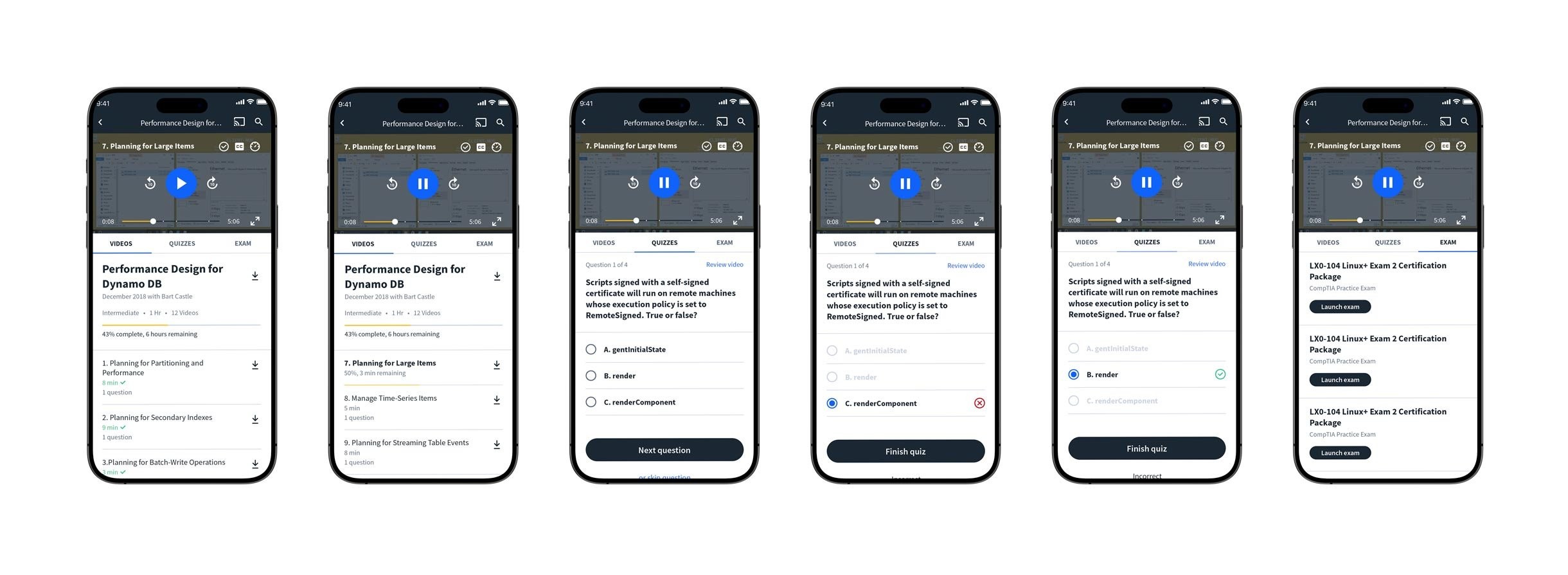
For the download feature, a spec existed — but specs don't account for the edge cases that only surface when you're designing actual screens. Empty states, partial downloads, storage warnings, failed downloads. I refined the UI to handle every state gracefully and designed an icon system that communicated status at a glance, without relying on text.
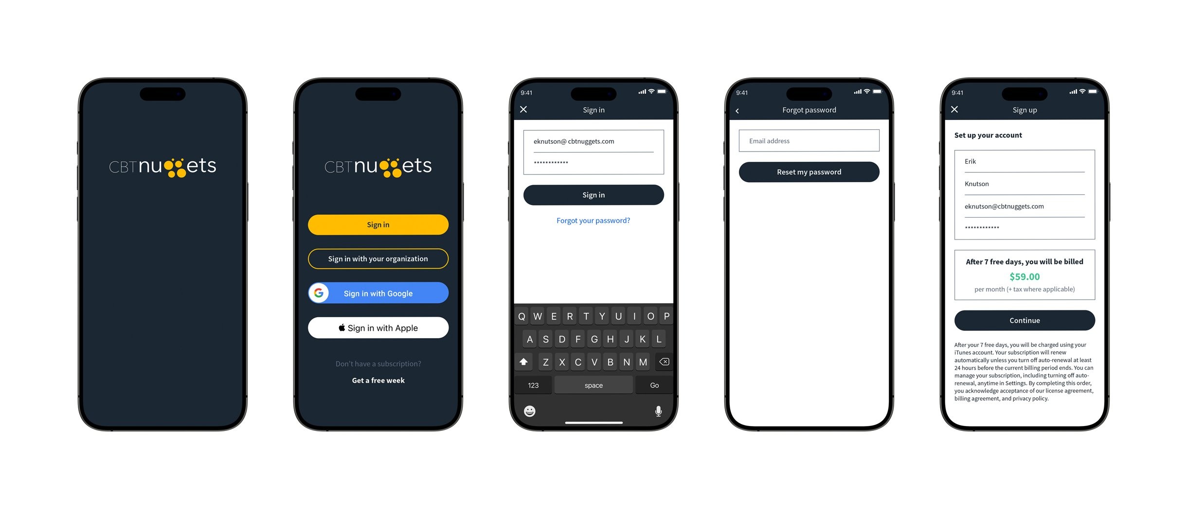
For the visual identity work, the brand team delivered updated guidelines built for web and print. Translating that into something native on iOS, Android, and Windows required judgment calls at every level — type scales, touch targets, color application in dark environments, interactive states. I kept the brand recognizable while making each platform feel like it belonged there.
Key Design Decisions
Where the real judgment calls happened
DECISION 01
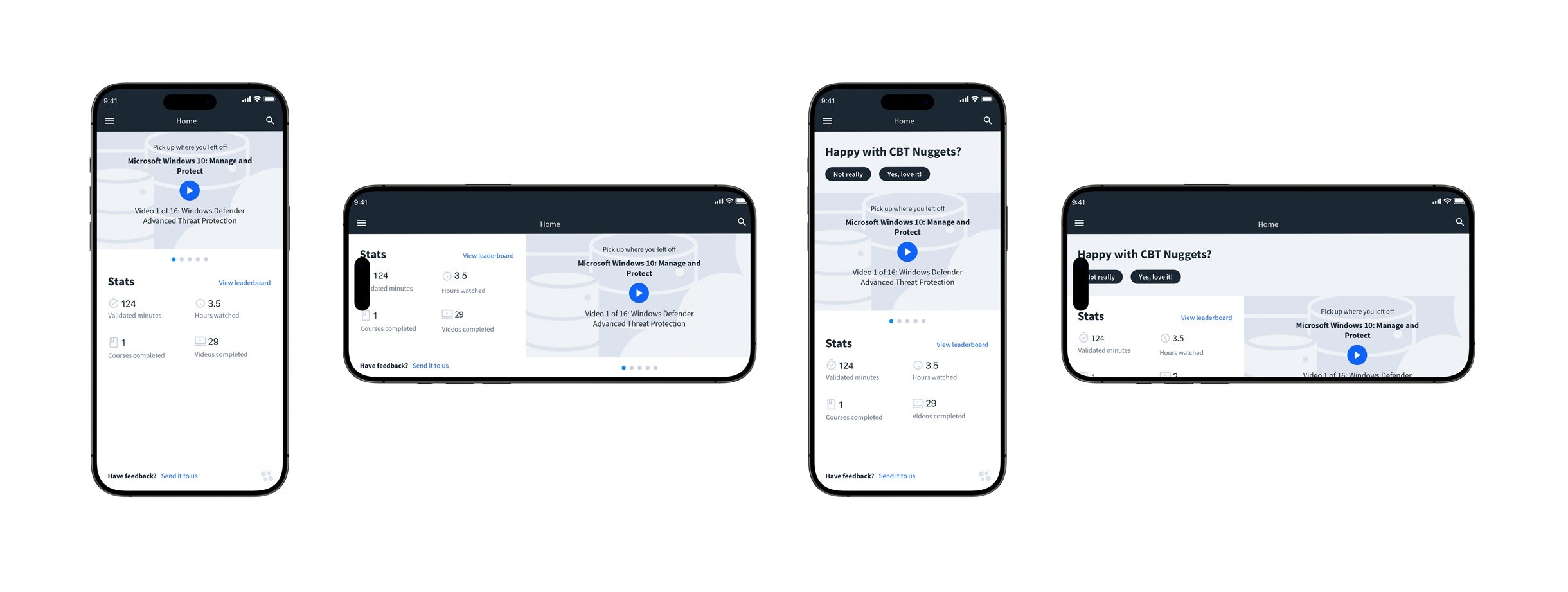
A three-state icon system for downloads
The spec called for download functionality but didn't define how status would be communicated visually. I landed on three distinct icon states — available, in progress (with an animated progress ring), and complete — each unambiguous at small sizes. The goal was zero confusion without a word of supporting text. IT learners saving content before a flight shouldn't have to wonder if something finished downloading.
Decision 02
Downloads as a first-class destination
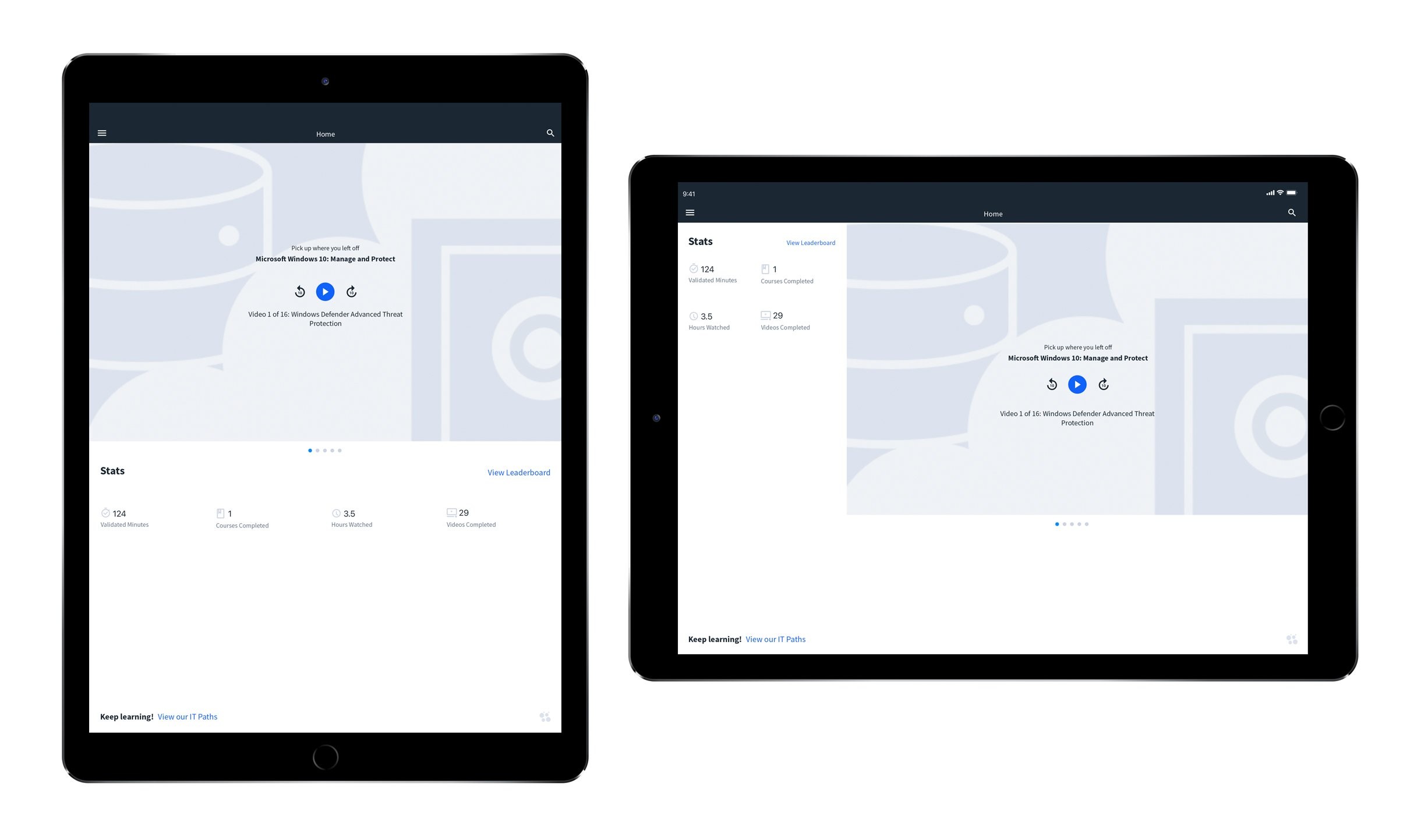
Downloads could have been buried in settings. I made it a top-level screen in the navigation — because a learner's offline library is functionally their portable classroom. It needed the same structural respect as the course library itself. The screen surfaces storage used, total duration, and file-level control, with an edit mode for bulk removal that mirrors native iOS conventions learners already knew.
Decision 03
Rebuilding components, not just reskinning them
The brand team's updated system was built for web. Applying it to mobile meant I rebuilt the component library from scratch rather than applying new colors to old components. Reskinning would have looked like a reskin. Where brand guidelines conflicted with platform HIG conventions, I documented the decision and aligned stakeholders explicitly — rather than quietly drifting from either standard.
Visual Identity System
Translating the brand to mobile
Working alongside the CBT Nuggets brand team, I built the mobile-specific layer of their updated visual identity — type scales, color tokens, interactive states, spacing, and iconography — that made the brand feel intentional on every screen and every platform. The signature dark navy and gold carried through, rebuilt into components that felt native rather than ported.
The updated system gave every screen a sharper, more considered feel while keeping the brand immediately recognizable to existing subscribers. The rebuild also gave the engineering team a cleaner handoff — documented tokens and component specs that made future work faster and more consistent across the team.
Visual Identity System
Translating the brand to mobile
The app's information architecture was already established when I joined. My first step was mapping it completely — understanding every screen, every connection — so I could identify precisely where the download feature and visual tokens needed to integrate without disturbing existing flows.
Process
The work behind the screens
The app's information architecture was already established when I joined. My first step was mapping it completely — understanding every screen, every connection — so I could identify precisely where the download feature and visual tokens needed to integrate without disturbing existing flows.
Final Screens
The shipped experience
These screens reflect the updated visual identity applied across the product — and the download feature fully integrated into the app's information hierarchy. Each surface was rebuilt with the new component library, not patched with new colors.
Reflection
What the work delivered
Shipping a visual identity update on a product with an active, loyal subscriber base is a high-stakes design problem. The update has to feel like progress, not disruption. Maintaining a 5-star rating through the refresh is the clearest signal that it landed the right way.
The download feature gave learners something genuinely new: a personal offline library, managed transparently, with clear status at every step. It removed the last barrier between CBT Nuggets' content and the moments in learners' days when they actually had time to train — on a commute, in a hotel, at a job site without reliable Wi-Fi.
Beyond the two initiatives, taking full design ownership of the system meant future feature work had a stable, documented foundation to build from — a component library, token system, and cross-platform spec that the team didn't have before.
Product Design · Feature Integration · Visual Identity · iOS · Android · Windows
Stepping into a live product and making it yours
I joined CBT Nuggets as the sole product designer on a native app suite already in market across five platforms. My work: bring a new download experience to life and translate a full visual identity update into a cohesive mobile UI — without disrupting what 100,000+ learners already depended on.
Outcome
Q4 2020 - Q1 2021
Platforms carrying the refreshed visual identity — consistently
App Store rating maintained through the full visual refresh
Of the training library available offline after download launch
ℹ️
The initial app architecture and launch were led by my predecessor. I inherited that foundation and took full design ownership from 2018 onward — responsible for all feature work, visual direction, and cross-platform consistency from that point forward.
Context
What I inherited, and what was mine to build
Starting on a live product is a different design problem than starting from zero. The hard architecture decisions had already been made — navigation patterns, content hierarchy, the core learning loop. My job was to understand those decisions well enough to extend the product without introducing friction, then bring two major initiatives forward: offline download management and a visual identity refresh across every platform.

INHERITED FOUNDATION
ALREADY IN MARKET
- App architecture across iOS, Android, Windows
- Navigation patterns and content hierarchy
- Authentication and account flows
- Video player and course detail screensInitial visual language and component library

MY CONTRIBUTION
MY SCOPE
- Download feature
- UI refinement and icon system design
- Visual identity update applied across all app surfaces
- Cross-platform consistency of the new VIS
- Collaboration with brand team on mobile translation
- Ongoing design ownership and system maintenance
The Challenge
Two initiatives, one shared constraint
Both projects — downloads and the visual identity update — shared the same underlying constraint: I couldn't break what was already working. CBT Nuggets had a loyal subscriber base who'd formed habits around the existing app. Any change to visual language or new feature had to feel like a natural extension, not a redesign.
"The best feature addition is one that feels like it was always there. The best visual refresh is one users notice feels better — without knowing why."
For the download feature, a spec existed — but specs don't account for the edge cases that only surface when you're designing actual screens. Empty states, partial downloads, storage warnings, failed downloads. I refined the UI to handle every state gracefully and designed an icon system that communicated status at a glance, without relying on text.
For the visual identity work, the brand team delivered updated guidelines built for web and print. Translating that into something native on iOS, Android, and Windows required judgment calls at every level — type scales, touch targets, color application in dark environments, interactive states. I kept the brand recognizable while making each platform feel like it belonged there.
Key Design Decisions
Where the real judgment calls happened
DECISION 01
A three-state icon system for downloads
The spec called for download functionality but didn't define how status would be communicated visually. I landed on three distinct icon states — available, in progress (with an animated progress ring), and complete — each unambiguous at small sizes. The goal was zero confusion without a word of supporting text. IT learners saving content before a flight shouldn't have to wonder if something finished downloading.
Decision 02
Downloads as a first-class destination
Downloads could have been buried in settings. I made it a top-level screen in the navigation — because a learner's offline library is functionally their portable classroom. It needed the same structural respect as the course library itself. The screen surfaces storage used, total duration, and file-level control, with an edit mode for bulk removal that mirrors native iOS conventions learners already knew.
Decision 03
Rebuilding components, not just reskinning them
The brand team's updated system was built for web. Applying it to mobile meant I rebuilt the component library from scratch rather than applying new colors to old components. Reskinning would have looked like a reskin. Where brand guidelines conflicted with platform HIG conventions, I documented the decision and aligned stakeholders explicitly — rather than quietly drifting from either standard.
Visual Identity System
Translating the brand to mobile
Working alongside the CBT Nuggets brand team, I built the mobile-specific layer of their updated visual identity — type scales, color tokens, interactive states, spacing, and iconography — that made the brand feel intentional on every screen and every platform. The signature dark navy and gold carried through, rebuilt into components that felt native rather than ported.
The updated system gave every screen a sharper, more considered feel while keeping the brand immediately recognizable to existing subscribers. The rebuild also gave the engineering team a cleaner handoff — documented tokens and component specs that made future work faster and more consistent across the team.
Visual Identity System
Translating the brand to mobile
The app's information architecture was already established when I joined. My first step was mapping it completely — understanding every screen, every connection — so I could identify precisely where the download feature and visual tokens needed to integrate without disturbing existing flows.
Process
The work behind the screens
The app's information architecture was already established when I joined. My first step was mapping it completely — understanding every screen, every connection — so I could identify precisely where the download feature and visual tokens needed to integrate without disturbing existing flows.
Final Screens
The shipped experience
These screens reflect the updated visual identity applied across the product — and the download feature fully integrated into the app's information hierarchy. Each surface was rebuilt with the new component library, not patched with new colors.
Reflection
What the work delivered
Shipping a visual identity update on a product with an active, loyal subscriber base is a high-stakes design problem. The update has to feel like progress, not disruption. Maintaining a 5-star rating through the refresh is the clearest signal that it landed the right way.
The download feature gave learners something genuinely new: a personal offline library, managed transparently, with clear status at every step. It removed the last barrier between CBT Nuggets' content and the moments in learners' days when they actually had time to train — on a commute, in a hotel, at a job site without reliable Wi-Fi.
Beyond the two initiatives, taking full design ownership of the system meant future feature work had a stable, documented foundation to build from — a component library, token system, and cross-platform spec that the team didn't have before.