

Case Study · UX/UI Design · 2024
Designing the tour that doubled Goddard's enrollment pipeline
How a zero-to-one online tour scheduler became the highest-performing conversion touchpoint across 500+ franchise locations.
Results
Scheduled tours in 2025 compaired to 22,543 scheduled in 2024
Tours scheduled in 2024, up from 22,543 the year prior
Increase in leads generated system-wide
Scheduled tours in 2025 compaired to 22,543 scheduled in 2024
Statistics captured Aug – Dec 2024 across all participating Goddard School franchise locations
Background
A trusted brand with a broken first step
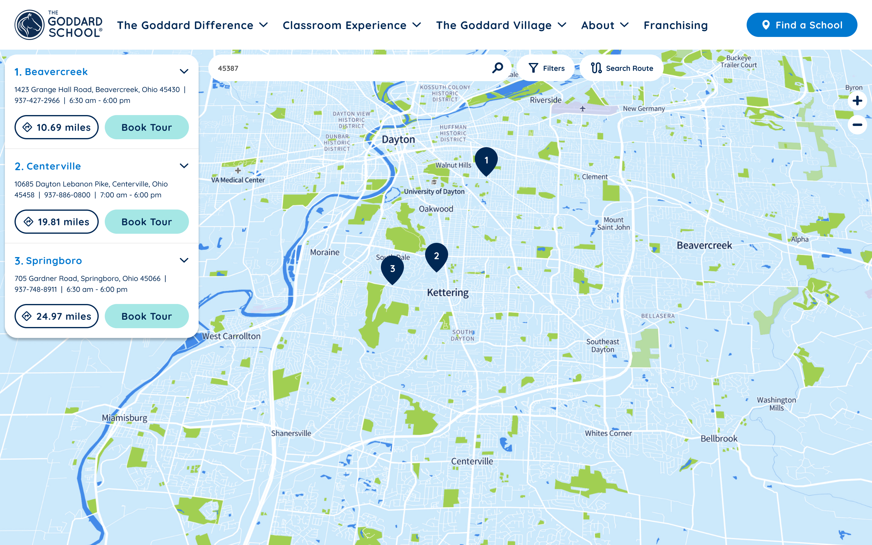
The Goddard School is a national franchise of 500+ private early childhood education centers, serving children from six weeks to six years old. Despite strong brand recognition and consistent demand, there was a significant friction point at the top of the enrollment funnel: parents who wanted to visit a school had to call to set up an appointment.
For a parent already navigating the most stressful consumer decision of their life, picking up the phone was one barrier too many.
"Nothing is more precious than their baby. Protecting their child isn't just consumer behavior — it's instinct. Every piece of friction in this flow carries emotional weight."
The opportunity was clear: build an online tour scheduling system from scratch that meets parents where they are — on their phones, on their terms, at any hour — and removes every unnecessary obstacle between interest and action.
Research & Discovery
Understanding the parent on the other side of the screen
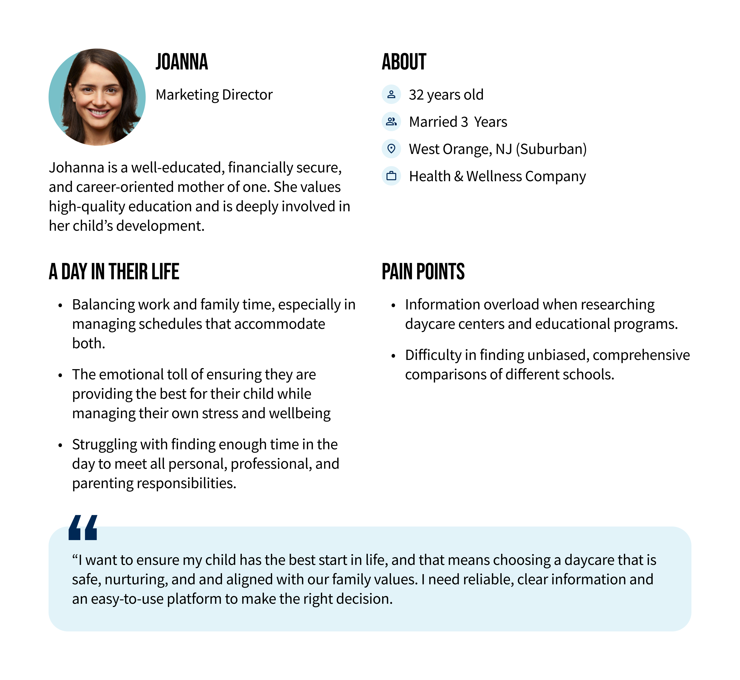
I drew on three sources to shape my understanding of the user: third-party market research on parent behavior in the early childhood education market, an internal Goddard consumer insights report built from parent surveys, and direct qualitative research I conducted.
The emotional stakes
70% of parents describe choosing a daycare or preschool as one of the most stressful decisions they've ever made. The bar for trust — and the bar for frustration — is exceptionally high.
The digital expectation
83% of parents who begin their school search online expect a seamless bridge between the digital experience and the in-person visit. A phone-only booking process breaks that expectation immediately.
Two distinct user modes
Most parents scheduling a tour want the soonest available slot. But a meaningful minority are expecting and planning months in advance. The design had to serve both without making either feel like an afterthought.
Time is the scarcest resource
Parents aren't leisurely comparing options. They're squeezing research into commutes and lunch breaks. Every extra screen, every unnecessary field, every moment of confusion is a dropout risk.
Design Approach
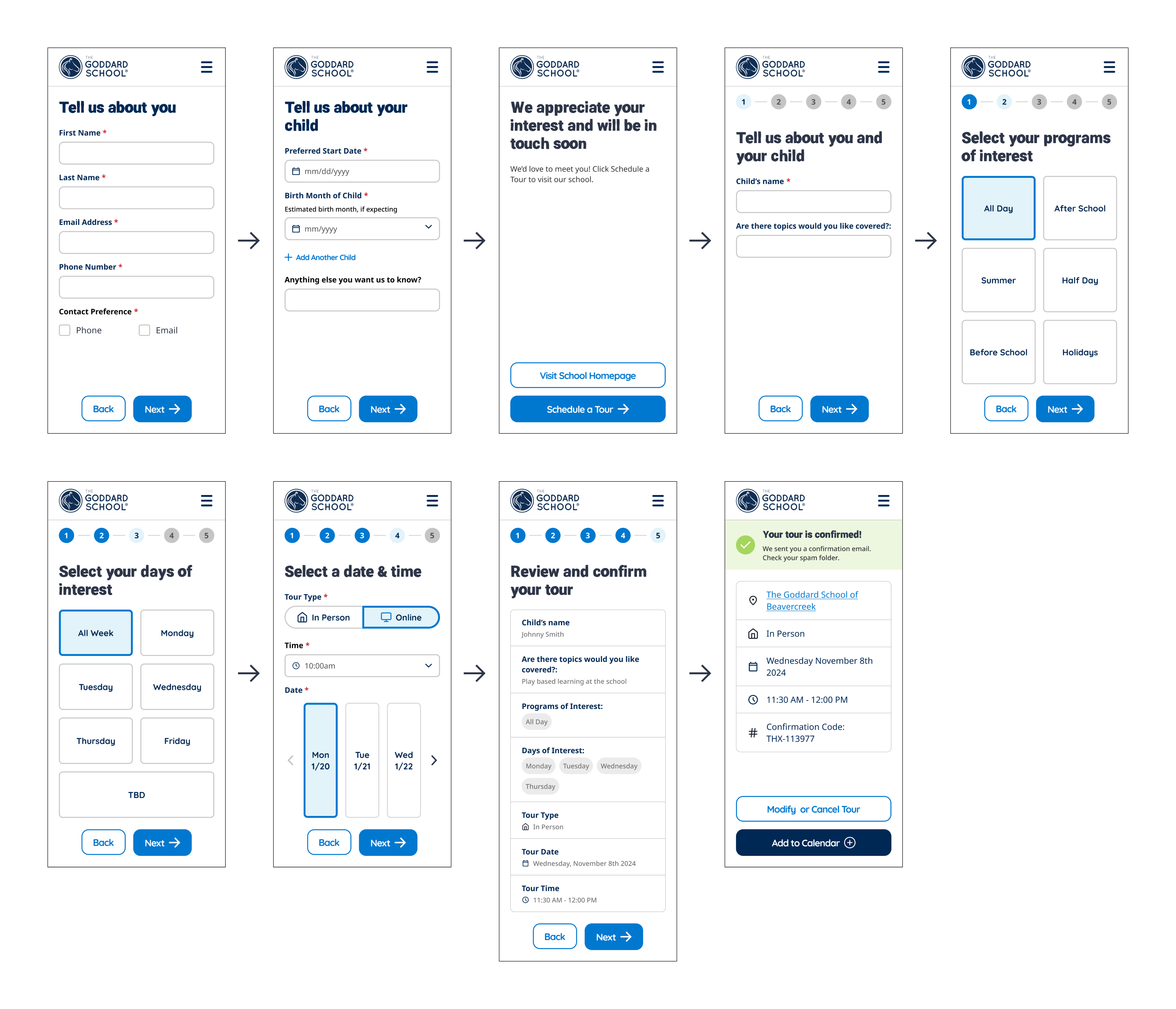
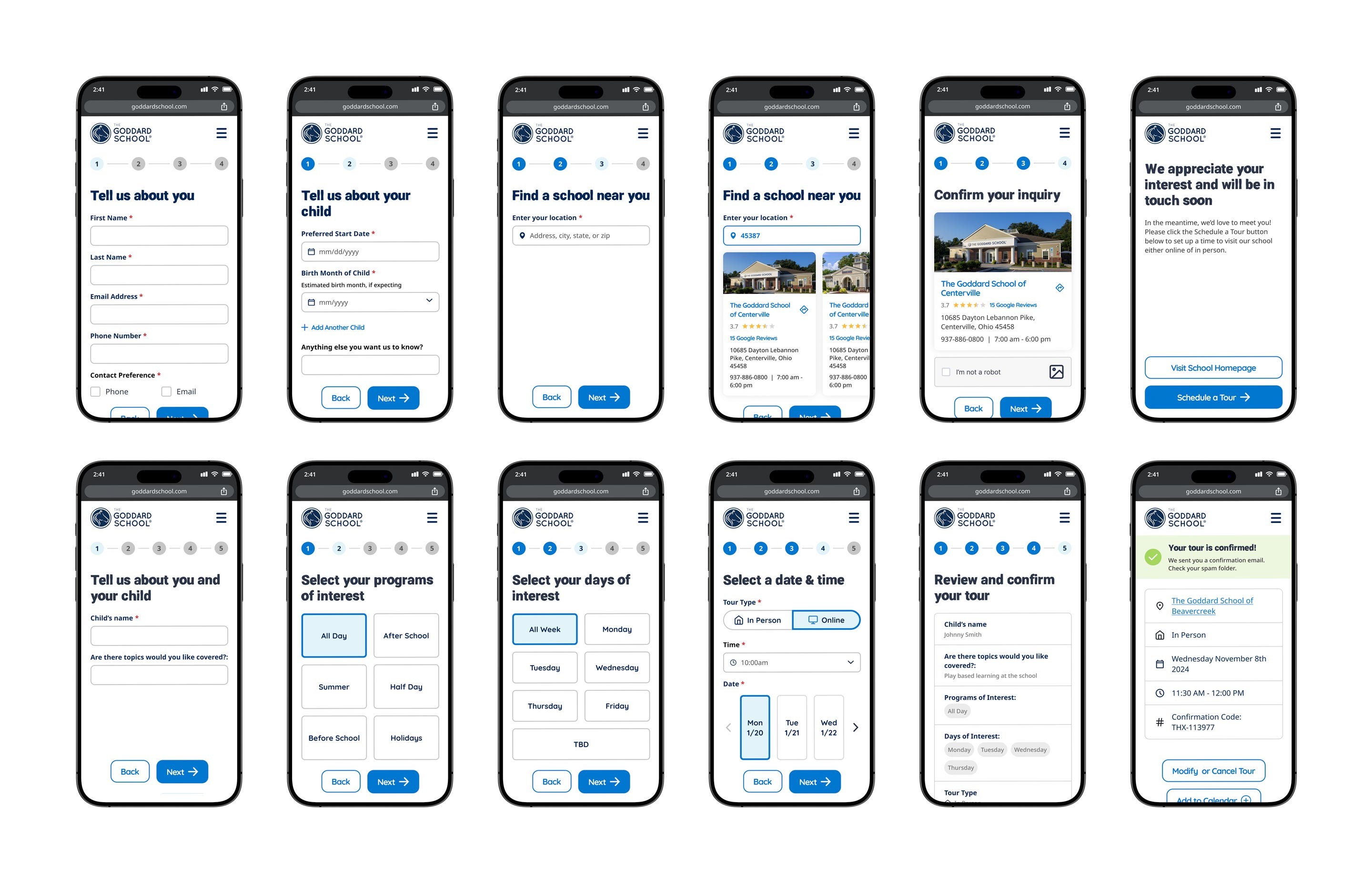
One flow. Two jobs. Zero wasted steps.
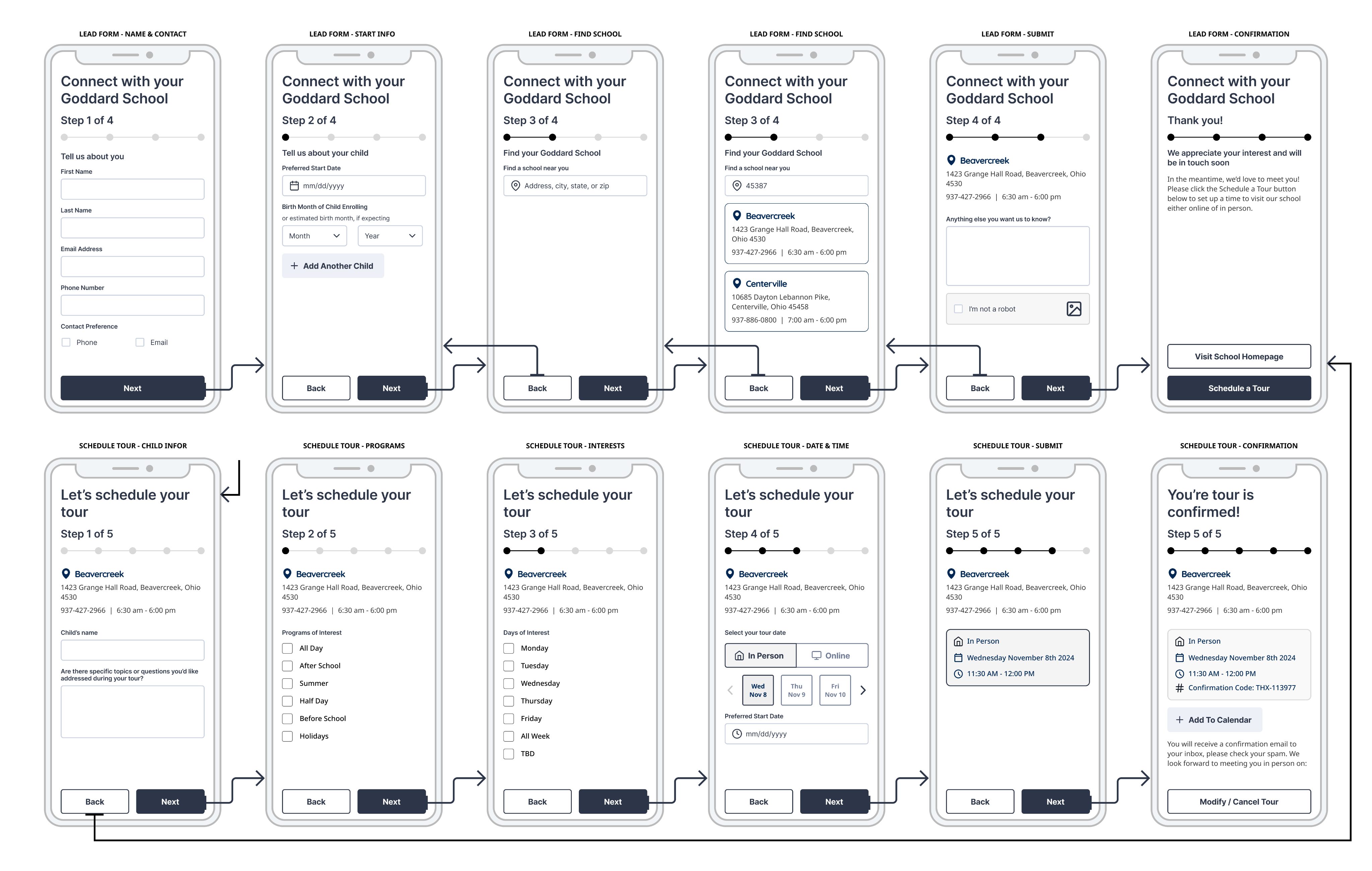
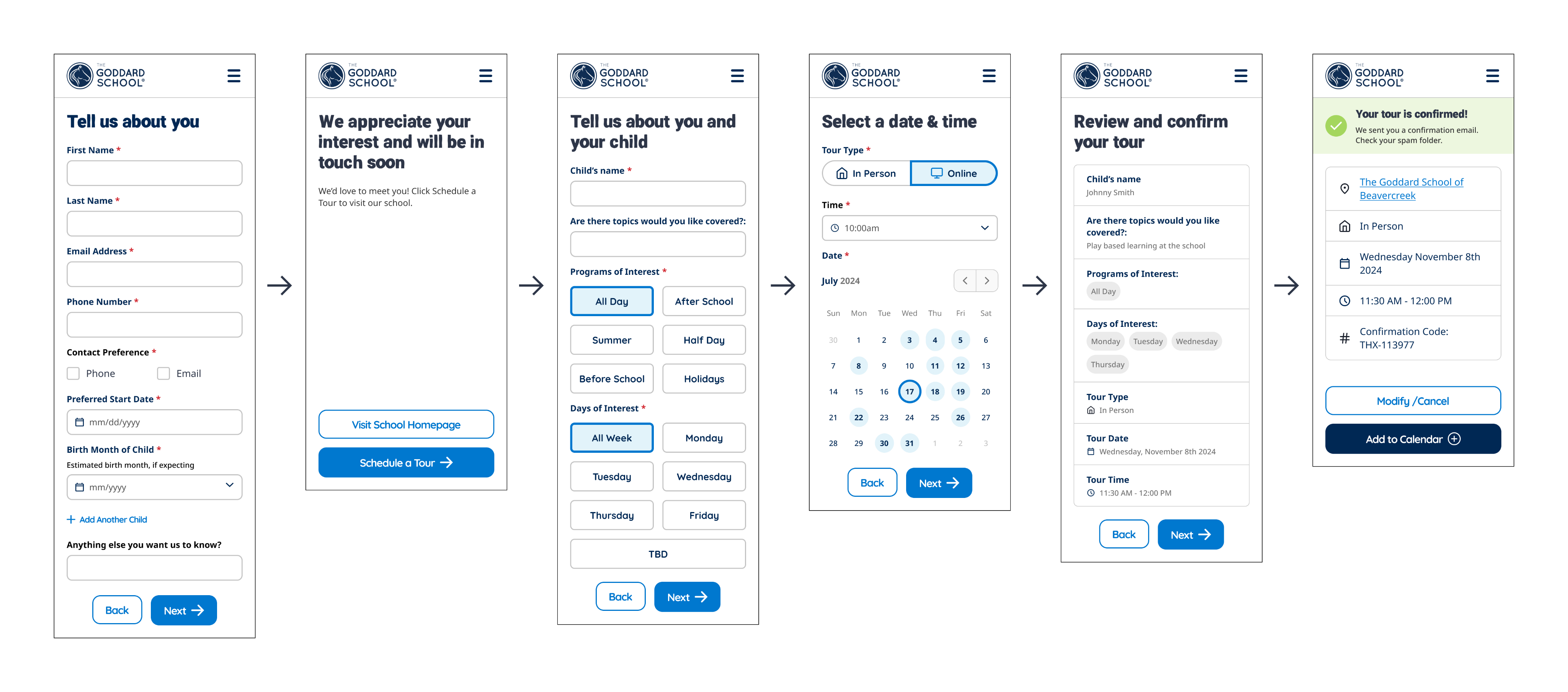
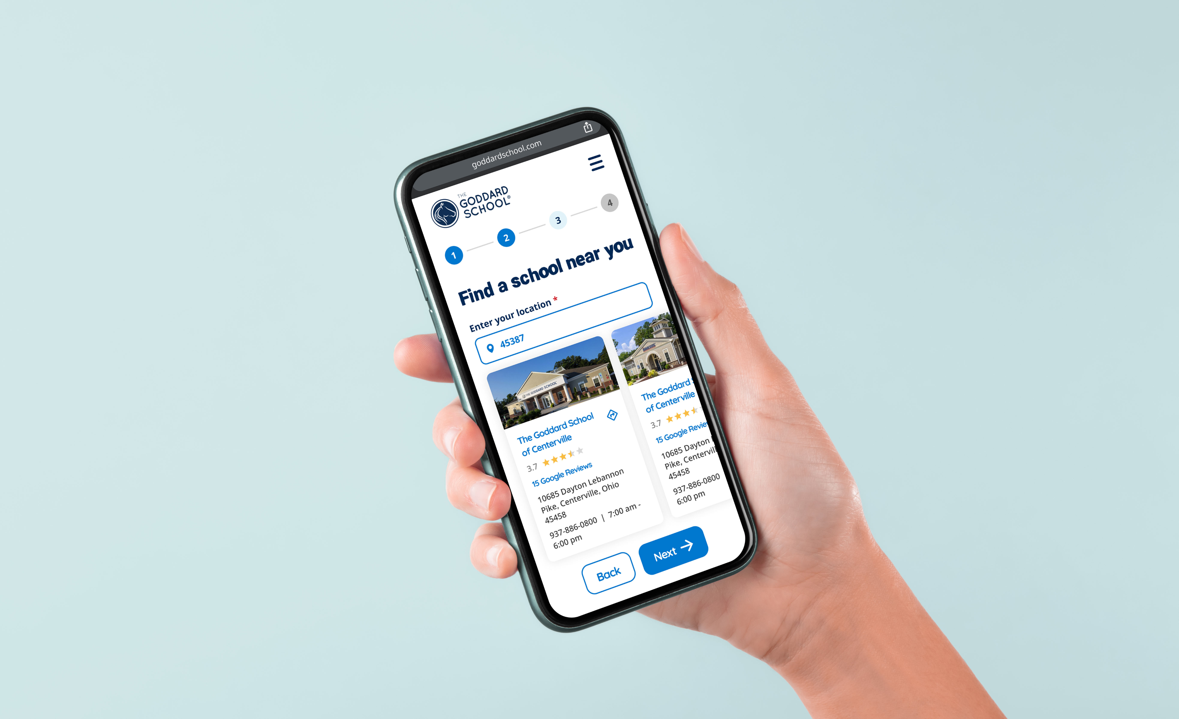
The tour scheduler had to accomplish two things in sequence: capture lead information for Goddard's CRM, then let the parent lock in a time. I designed these as a unified, step-by-step experience rather than two separate forms — so it felt like a single, guided conversation rather than back-to-back data entry.
1
About you

2
Programs of interest
3
Select Date

4
Date & time
5
Review & confirm
6
Tour Confirmed
One intentional detail worth noting: Step 3 (Select School) is skipped entirely if a parent enters through a specific school's location page, since they've already made that choice. Context-awareness over rigid process.
For the date picker, I deliberately moved away from a full calendar view. Showing an entire month of available and unavailable days adds cognitive load for the majority of parents who just want the next open slot. The final design surfaces the soonest available days prominently — but still allows date browsing for parents who are planning ahead.
💡
Design decision: soonest-first date selection
Research showed most parents want the nearest available tour. Rather than a traditional calendar grid that highlights unavailability, I designed a horizontal scroll of upcoming open dates. This reduces cognitive load while still supporting the "I'm due in March" use case.
Wireframing
Getting the structure right before the pixels
I wireframed the full end-to-end flow — from the school homepage through to the confirmation screen — before introducing any visual design. This stage was where the core structural decisions were made: how many steps, what information lives where, and how to handle branching logic like the multi-school selector.
Usability Testing
We thought we knew. The data disagreed.
With a first high-fidelity prototype built and the design system applied, I launched an unmoderated click-through test via Lyssna with 250 participants matching the target demographic: ages 18–50, household income $100K+, 1–5 children, US-based.
The task was simple: book a tour. The instruction was: tell us where you get confused.
Round 1 Task Completion
Finding: information density was the obstacle
Users found individual screens overwhelming — too many fields per step. The mental effort of completing each screen was causing abandonment before the next one. We needed to get to 90%+ before shipping.
The insight from the data pointed toward one clear hypothesis: users didn't need less information — they needed smaller doses of it. I restructured the flow to break multi-input screens into individual focused steps, giving users a sense of quick, frequent progress rather than one long slog.
91%
Round 2 Task Completion
Confirmed: progressive disclosure works
The restructured flow crossed the 90% threshold. Participants moved through each step faster and reported less confusion. The design was ready to move toward final production.
Final Design
Clean, confident, and built for the 11pm decision
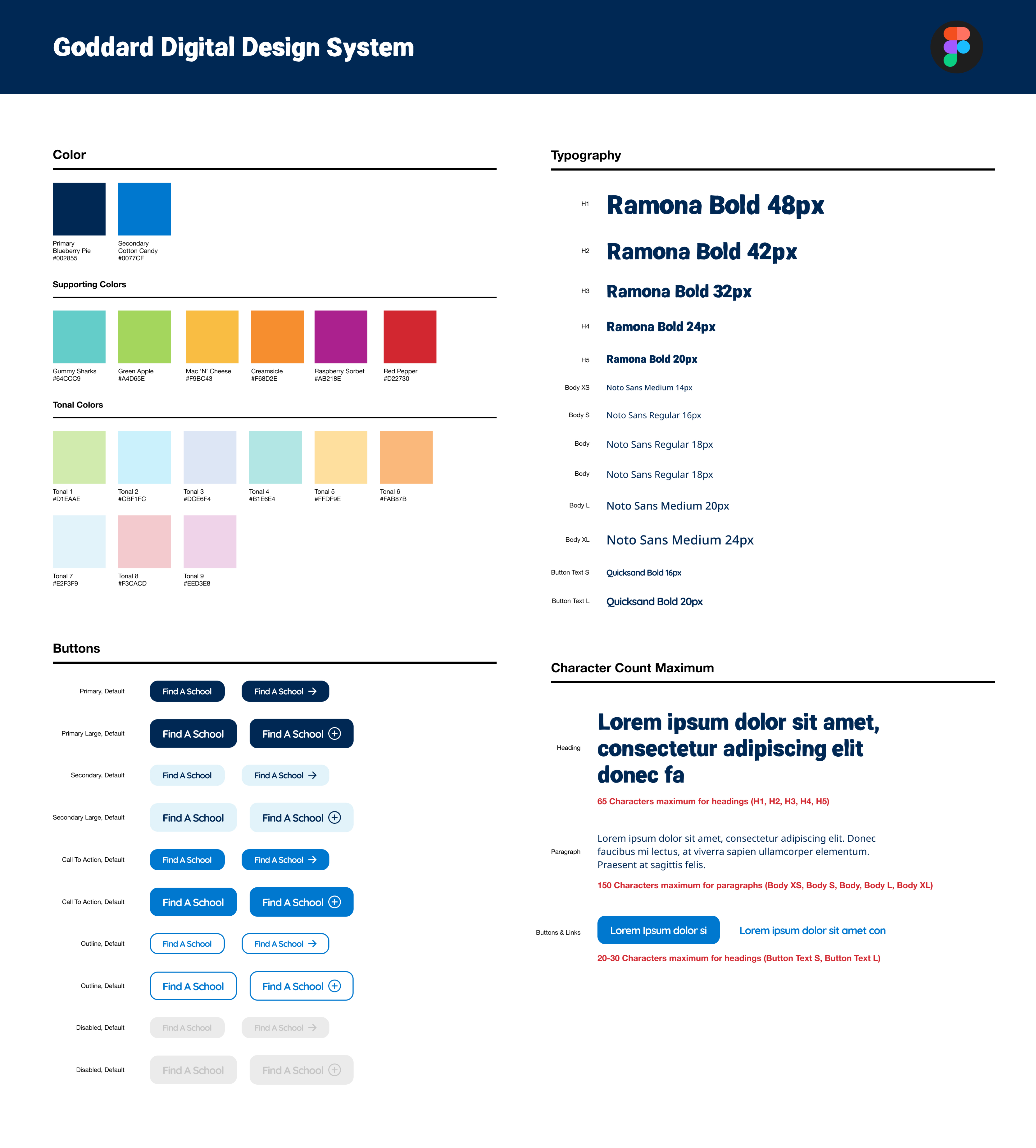
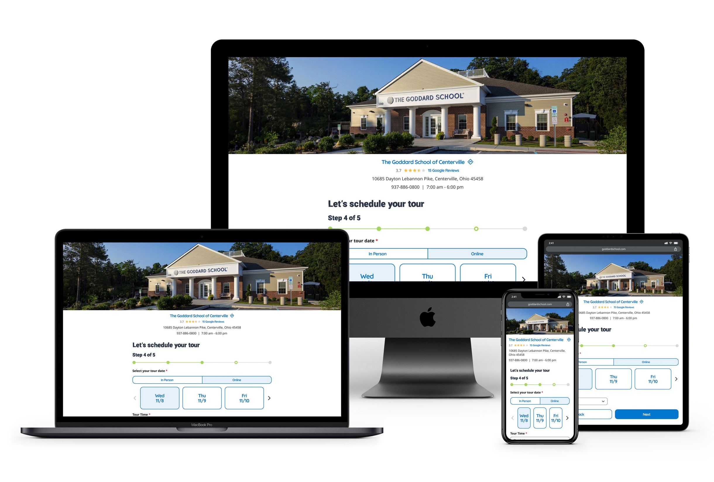
The final design applied the Goddard Digital Design System — a system I also helped develop — to the tested and validated flow structure. The visual language is warm and trustworthy, designed for parents who are making a high-stakes decision, often on a phone, often late at night.
[ANIMATION OPPORTUNITY - STEP THROUGH TRANSITION]
Reflection
What this project taught me
The biggest lesson here wasn't a design pattern — it was a reminder about assumptions. The first prototype felt solid. It looked good, the flow made logical sense, and the team was confident. The usability data said otherwise.
Splitting a form that looks "reasonable" on a design canvas into smaller steps might seem like over-engineering until you watch real people abandon it in real time. That 12-point jump in task completion between iterations wasn't accidental — it was the direct result of listening to what the data was actually saying rather than defending the original decision.
The other thing worth noting: the emotional context of the user. Designing for a parent choosing childcare isn't the same as designing for someone booking a restaurant. The stakes are higher, the hesitation is real, and every piece of friction carries more weight. Good UX here isn't just about efficiency — it's about building enough trust to get someone to show up.
Case Study · UX/UI Design · 2024
Designing the tour that doubled Goddard's enrollment pipeline
How a zero-to-one online tour scheduler became the highest-performing conversion touchpoint across 500+ franchise locations.
Results
Scheduled tours in 2025 compaired to 22,543 scheduled in 2024
Tours scheduled in 2024, up from 22,543 the year prior
Increase in leads generated system-wide
Scheduled tours in 2025 compaired to 22,543 scheduled in 2024
Statistics captured Aug – Dec 2024 across all participating Goddard School franchise locations
Background
A trusted brand with a broken first step
The Goddard School is a national franchise of 500+ private early childhood education centers, serving children from six weeks to six years old. Despite strong brand recognition and consistent demand, there was a significant friction point at the top of the enrollment funnel: parents who wanted to visit a school had to call to set up an appointment.
For a parent already navigating the most stressful consumer decision of their life, picking up the phone was one barrier too many.
"Nothing is more precious than their baby. Protecting their child isn't just consumer behavior — it's instinct. Every piece of friction in this flow carries emotional weight."
The opportunity was clear: build an online tour scheduling system from scratch that meets parents where they are — on their phones, on their terms, at any hour — and removes every unnecessary obstacle between interest and action.
Research & Discovery
Understanding the parent on the other side of the screen
I drew on three sources to shape my understanding of the user: third-party market research on parent behavior in the early childhood education market, an internal Goddard consumer insights report built from parent surveys, and direct qualitative research I conducted.
The emotional stakes
70% of parents describe choosing a daycare or preschool as one of the most stressful decisions they've ever made. The bar for trust — and the bar for frustration — is exceptionally high.
The digital expectation
83% of parents who begin their school search online expect a seamless bridge between the digital experience and the in-person visit. A phone-only booking process breaks that expectation immediately.
Two distinct user modes
Most parents scheduling a tour want the soonest available slot. But a meaningful minority are expecting and planning months in advance. The design had to serve both without making either feel like an afterthought.
Time is the scarcest resource
Parents aren't leisurely comparing options. They're squeezing research into commutes and lunch breaks. Every extra screen, every unnecessary field, every moment of confusion is a dropout risk.
Design Approach
One flow. Two jobs. Zero wasted steps.
The tour scheduler had to accomplish two things in sequence: capture lead information for Goddard's CRM, then let the parent lock in a time. I designed these as a unified, step-by-step experience rather than two separate forms — so it felt like a single, guided conversation rather than back-to-back data entry.
1
About you

2
Programs of interest

3
Select Date

4
Date & time

5
Review & confirm

6
Tour Confirmed
One intentional detail worth noting: Step 3 (Select School) is skipped entirely if a parent enters through a specific school's location page, since they've already made that choice. Context-awareness over rigid process.
For the date picker, I deliberately moved away from a full calendar view. Showing an entire month of available and unavailable days adds cognitive load for the majority of parents who just want the next open slot. The final design surfaces the soonest available days prominently — but still allows date browsing for parents who are planning ahead.
💡
Design decision: soonest-first date selection
Research showed most parents want the nearest available tour. Rather than a traditional calendar grid that highlights unavailability, I designed a horizontal scroll of upcoming open dates. This reduces cognitive load while still supporting the "I'm due in March" use case.
Wireframing
Getting the structure right before the pixels
I wireframed the full end-to-end flow — from the school homepage through to the confirmation screen — before introducing any visual design. This stage was where the core structural decisions were made: how many steps, what information lives where, and how to handle branching logic like the multi-school selector.
Usability Testing
We thought we knew. The data disagreed.
With a first high-fidelity prototype built and the design system applied, I launched an unmoderated click-through test via Lyssna with 250 participants matching the target demographic: ages 18–50, household income $100K+, 1–5 children, US-based.
The task was simple: book a tour. The instruction was: tell us where you get confused.
Round 1 Task Completion
Finding: information density was the obstacle
Users found individual screens overwhelming — too many fields per step. The mental effort of completing each screen was causing abandonment before the next one. We needed to get to 90%+ before shipping.
The insight from the data pointed toward one clear hypothesis: users didn't need less information — they needed smaller doses of it. I restructured the flow to break multi-input screens into individual focused steps, giving users a sense of quick, frequent progress rather than one long slog.
91%
Round 2 Task Completion
Confirmed: progressive disclosure works
The restructured flow crossed the 90% threshold. Participants moved through each step faster and reported less confusion. The design was ready to move toward final production.
Final Design
Clean, confident, and built for the 11pm decision
The final design applied the Goddard Digital Design System — a system I also helped develop — to the tested and validated flow structure. The visual language is warm and trustworthy, designed for parents who are making a high-stakes decision, often on a phone, often late at night.
[ANIMATION OPPORTUNITY - STEP THROUGH TRANSITION]
Reflection
What this project taught me
The biggest lesson here wasn't a design pattern — it was a reminder about assumptions. The first prototype felt solid. It looked good, the flow made logical sense, and the team was confident. The usability data said otherwise.
Splitting a form that looks "reasonable" on a design canvas into smaller steps might seem like over-engineering until you watch real people abandon it in real time. That 12-point jump in task completion between iterations wasn't accidental — it was the direct result of listening to what the data was actually saying rather than defending the original decision.
The other thing worth noting: the emotional context of the user. Designing for a parent choosing childcare isn't the same as designing for someone booking a restaurant. The stakes are higher, the hesitation is real, and every piece of friction carries more weight. Good UX here isn't just about efficiency — it's about building enough trust to get someone to show up.
Case Study · UX/UI Design · 2024
Designing the tour that doubled Goddard's enrollment pipeline
How a zero-to-one online tour scheduler became the highest-performing conversion touchpoint across 500+ franchise locations.
Results
Increase in scheduled tours (conversion rate)
Tours scheduled in 2024, up from 22,543 the year prior
Increase in leads generated system-wide
Increase in enrollment post-tour scheduler launch
Statistics captured Aug – Dec 2024 across all participating Goddard School franchise locations
Background
A trusted brand with a broken first step
The Goddard School is a national franchise of 500+ private early childhood education centers, serving children from six weeks to six years old. Despite strong brand recognition and consistent demand, there was a significant friction point at the top of the enrollment funnel: parents who wanted to visit a school had to call to set up an appointment.
For a parent already navigating the most stressful consumer decision of their life, picking up the phone was one barrier too many.
"Nothing is more precious than their baby. Protecting their child isn't just consumer behavior — it's instinct. Every piece of friction in this flow carries emotional weight."
The opportunity was clear: build an online tour scheduling system from scratch that meets parents where they are — on their phones, on their terms, at any hour — and removes every unnecessary obstacle between interest and action.
Research & Discovery
Understanding the parent on the other side of the screen
I drew on three sources to shape my understanding of the user: third-party market research on parent behavior in the early childhood education market, an internal Goddard consumer insights report built from parent surveys, and direct qualitative research I conducted.
The emotional stakes
70% of parents describe choosing a daycare or preschool as one of the most stressful decisions they've ever made. The bar for trust — and the bar for frustration — is exceptionally high.
The digital expectation
83% of parents who begin their school search online expect a seamless bridge between the digital experience and the in-person visit. A phone-only booking process breaks that expectation immediately.
Two distinct user modes
Most parents scheduling a tour want the soonest available slot. But a meaningful minority are expecting and planning months in advance. The design had to serve both without making either feel like an afterthought.
Time is the scarcest resource
Parents aren't leisurely comparing options. They're squeezing research into commutes and lunch breaks. Every extra screen, every unnecessary field, every moment of confusion is a dropout risk.
Design Approach
One flow. Two jobs. Zero wasted steps.
The tour scheduler had to accomplish two things in sequence: capture lead information for Goddard's CRM, then let the parent lock in a time. I designed these as a unified, step-by-step experience rather than two separate forms — so it felt like a single, guided conversation rather than back-to-back data entry.
1
About you

2
Programs of interest

3
Select Date

4
Date & time

5
Review & confirm

6
Tour Confirmed
One intentional detail worth noting: Step 3 (Select School) is skipped entirely if a parent enters through a specific school's location page, since they've already made that choice. Context-awareness over rigid process.
For the date picker, I deliberately moved away from a full calendar view. Showing an entire month of available and unavailable days adds cognitive load for the majority of parents who just want the next open slot. The final design surfaces the soonest available days prominently — but still allows date browsing for parents who are planning ahead.
💡
Design decision: soonest-first date selection
Research showed most parents want the nearest available tour. Rather than a traditional calendar grid that highlights unavailability, I designed a horizontal scroll of upcoming open dates. This reduces cognitive load while still supporting the "I'm due in March" use case.
Wireframing
Getting the structure right before the pixels
I wireframed the full end-to-end flow — from the school homepage through to the confirmation screen — before introducing any visual design. This stage was where the core structural decisions were made: how many steps, what information lives where, and how to handle branching logic like the multi-school selector.
Usability Testing
We thought we knew. The data disagreed.
With a first high-fidelity prototype built and the design system applied, I launched an unmoderated click-through test via Lyssna with 250 participants matching the target demographic: ages 18–50, household income $100K+, 1–5 children, US-based.
The task was simple: book a tour. The instruction was: tell us where you get confused.
Round 1 Task Completion
Finding: information density was the obstacle
Users found individual screens overwhelming — too many fields per step. The mental effort of completing each screen was causing abandonment before the next one. We needed to get to 90%+ before shipping.
The insight from the data pointed toward one clear hypothesis: users didn't need less information — they needed smaller doses of it. I restructured the flow to break multi-input screens into individual focused steps, giving users a sense of quick, frequent progress rather than one long slog.
Round 2 Task Completion
Confirmed: progressive disclosure works
The restructured flow crossed the 90% threshold. Participants moved through each step faster and reported less confusion. The design was ready to move toward final production.
Final Design
Clean, confident, and built for the 11pm decision
The final design applied the Goddard Digital Design System — a system I also helped develop — to the tested and validated flow structure. The visual language is warm and trustworthy, designed for parents who are making a high-stakes decision, often on a phone, often late at night.
[ANIMATION OPPORTUNITY - STEP THROUGH TRANSITION]
Reflection
What this project taught me
The biggest lesson here wasn't a design pattern — it was a reminder about assumptions. The first prototype felt solid. It looked good, the flow made logical sense, and the team was confident. The usability data said otherwise.
Splitting a form that looks "reasonable" on a design canvas into smaller steps might seem like over-engineering until you watch real people abandon it in real time. That 12-point jump in task completion between iterations wasn't accidental — it was the direct result of listening to what the data was actually saying rather than defending the original decision.
The other thing worth noting: the emotional context of the user. Designing for a parent choosing childcare isn't the same as designing for someone booking a restaurant. The stakes are higher, the hesitation is real, and every piece of friction carries more weight. Good UX here isn't just about efficiency — it's about building enough trust to get someone to show up.